

Baobab Clothing, Inc. is a new men’s “smart luxury” lifestyle brand, based in New York, NY, founded by Brandon Davenport and Marcellus Alexander. The Baobab Team requested a functional prototype of an e-commerce website to showcase their signature product, the Baobab Polo, for continued brand investment.
PROJECT CONSIDERATIONS
- PROJECT TIMELINE: 2 Weeks
- ROLE: UX Designer, User Researcher, Scrum Master
- TEAM: Caitlin Aylward, Ramón Gamarra, Diego Mas González
- TOOLS: Screener Surveys, User Interviews, Contextual Inquiries, Affinity Mapping, Design Studios, Feature Prioritization, Persona Development, Prototype Ideation, Prototype Iteration, Usability Testing, Sketch, and InVision
- DELIVERABLES: Statement of Work, Finalized Sketch Hi-Fidelity Prototype, Client Project Invision Link, Client Presentation PDF, Specifications Document
PROJECT CHALLENGE
When consumers have consistently positive experiences with brands, they become loyal customers. Baobab is a new-to-market brand. How might we create an e-commerce enabled website that communicates trust and instills confidence in first-time buyers, while providing existing customers with relevant lifestyle content between purchases?
PROJECT SOLUTION
The Baobab website is an e-commerce and content platform showcasing the Baobab Brand, and the Baobab Polo. Please click this link to launch the Baobab prototype.
PHASE 1: STAKEHOLDER MEETING & KICK-OFF
Meeting with the Baobab Founders, our UX Team wanted to better understand how the founders viewed their emerging brand — what retail companies inspired them as they went about creating their company? In addition to this, what additional prototype requirements would be required for our team to incorporate into our final deliverable?
As we conducted this initial interview, I took vigorous notes and written quotations to better understand what the founders wanted to convey through this engagement. Highlights from this opening conversation included:
“I want to create a beautiful, functional website…to understand and connect with our product so that they [customers] can build trust and be inspired to buy.”
“For content, we want to be a thought leader and influence customers to make purchases.”
“It’d be interesting to understand what inspires folks to buy online, from a company they’ve never heard of before.”
“The check-out process [online], it’s all the same — but is there room to grow?”
As the conversation continued, the Baobab Team also provided us with several key brands that influenced them in their initial creation of the brand, including Allbirds and GQ, specifically.
In addition to this, the team shared that, at the time, their current customers were mostly urban males located either in a major metropolitan area or outside of a city center.
Taking this feedback, our UX Team summarized the mission of what the Baobab website prototype would convey to those interested in the brand:

PHASE 2: MARKET RESEARCH & ANALYSIS
Through this initial discussion, we began the next phase of our design sprint by taking a four-step approach towards our UX research — these research methods would be conducted in the following manner:
- Competitive Analysis: Now better understanding Baobab’s comparators, we could consider digital competitors in the existing retail landscape and how they approached e-commerce, data capture, and content creation.
- Online Contextual Inquiries: Based on inspirational and competitive brands, how did e-commerce customers interact with similar websites? What could be learned from them?
- 3x E-Commerce Shoppers would be interviewed in this phase.
- Screener Survey Sampling: Looking at potential Baobab consumers, what are their current shopping behaviors online? How do they interact with digital content?
- 18x Survey Respondents would complete our survey.
- 1:1 User Interviews: Direct user interviews would provide us with an understanding of how primary and secondary Baobab customers not only discover new brands but what they look for in an e-commerce online experience and how they develop confidence in a new brand.
- 3x Baobab Primary Customers would be interviewed (those who already owned the shirt)
- 7x Secondary Customers would be interviewed from the Screener Sampling (those who had not owned the shirt but shopped online and wanted to share more about their clothing shopping habits)
Beginning first with the Competitive Analysis piece, our UX Team was able to determine additional brands competing in Baobab’s sphere or whom were also similar in a singular product that they were looking to provide to customers.

Now having this competitive and comparative list, we narrowed our scope to four websites that we would use in our online contextual inquiry phase.
I conducted three user tests to see how e-commerce customers felt about the aesthetics of these websites, the checkout process and if any editorial content provided was engaging enough for these users to refrain from abandoning the task asked of them when navigating the site (i.e. scanning the homepage, adding a product to cart, or going through a mock-check-out process for a product). I encouraged users to navigate the websites as they would normally, while speaking out loud as they explored them.
From these tests, the feedback we received could be summarized as the following:
- Users preferred visual websites that were also interactive
- Users favored simple compared to visually complex designs
- Users desired numeric steps when completing a task (i.e. product checkout) compared to receiving zero hints of task completion

In conjunction with these contextual inquiries, our team drafted a screener survey to gather feedback from external users whom regularly shopped online for their clothing and product needs as well.
A sampling of survey questions who asked of our respondents include the following:
- What factors are most important to you when you shop for clothes?
- Do customer reviews and feedback factor into your purchasing decisions?
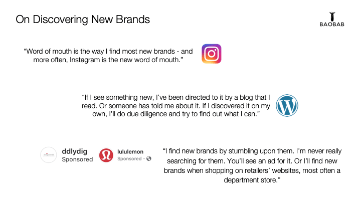
- How do you find new clothing brands?
- What makes you confident when purchasing from a new brand?

In reviewing our eighteen respondents’ feedback, 72% of respondents confirmed being fairly open to buying from an unknown brand, with another 60% of total respondents confirming that they sought out fashion advice through editorial and lifestyle content.
It was apparent here that respondents felt that digital tools — social media, blogs, ads — were influencing them in their purchasing decisions.
What proved most interesting, as our research moved forward, was how the feedback gathered from secondary, potential customers from our project research complimented the mindset of the three Baobab Polo customers that the Baobab Team had provided us to connect with.
While the original Baobab customers were open to trying new products, they were wary of gathering feedback and assessing company policies before purchasing from a new brand.

These customers, due to their ownership and use of the shirt, also listed unique features that kept them engaged with the brand for the long run — wrinkle-free material, quick-dry cotton, slim-cut design — all of these kept them loyal to the brand.
“In terms of the shirt, it’s a great travel shirt – it barely wrinkles, and when it does, they come out quickly. Plus, it’s water resistant!”
“I’m a big fan of dry-fit shirts — it’s a classier look than a Nike Golf Polo…plus, it’s odor repellent. I have’t yet washed the shirt and it doesn’t smell.
“While I knew it was sold as a men’s shirt and I had ordered it for my husband, I decided to order a small and it fit! The material was great and it’s now one of my favorite shirts.”
PHASE 3: PROBLEM SPACE & USER PERSONAS
Now that both our primary and secondary users had shared their unique insights regarding their shopping behaviors and product engagement, our UX Team developed a problem statement to guide our work:
When customers have consistently positive experiences with brands, they become loyal customers. Baobab is a new-to-market brand. How might we create an e-commerce enabled website that communicates trust and instills confidence in first-time customers, while providing existing customers with relevant lifestyle content in-between purchases?
Throughout my design exercises, I enjoyed creating User Personas for stakeholders and teams to empathize with. In this client project I asked to do the same, creating both a primary and secondary persona archetype based on our previous interviews.
Based on our pool of users, 2x demographics emerged: men who wore the shirt while traveling (or for their work) and women who had purchased the shirt for their significant others.
In creating these personas, I developed the user journey for each person, making them even more relatable for our stakeholders.
Please meet Jamie, and Victoria.


PHASE 4: FEATURES & DESIGN ITERATIONS
The next task in our design planning was to craft a MoSCoW map – features that were “must haves”, “should haves”, “could haves” or “won’t have” for our prototype.
Based on our research with users and the required client deliverables, we concluded on this list, with items in bold being emphasized by users as critical to their shopping experience (some of these qualities were also emphasized in the quotes provided above in Phase 1).

Now with the core features mapped out, we began our lo-fidelity sketches. Through our user interviews in Phase 1, we found that people navigated the “All Birds” and “Mr. Porter” websites relatively easily, so we felt it ideal to keep the Baobab homepage and checkout experience similar to these websites.
Our major iterations came in our development of innovative checkout features (i.e. a Weather API), along with a client-requested editorial section for Baobab to host editorial content. This “content hub” was carried over in all of our designs as we worked through the design sprint.
Below, you can see an overview of these lo-fi sketches and how they helped showcase the usability of our prototype.


In testing these lo-fidelity screens, I developed a script to keep users on track as they navigated the website with a total of three tasks to complete:
- To purchase the Baobab Polo
- To examine the editorial content of the new Baobab website
- To discover and read the story behind the company
Through usability testing, we found that all three users successfully completed these tasks, with some pushback coming from some aesthetical choices, as well as our editorial content; specifically, users felt that this content was “self-serving”.

With utility being confirmed in lo-fidelity tests, changes were not drastic in terms of our Mid-Fidelity prototype. Users completed the three assigned tasks from the prior prototype but had some confusion with several of our pages due to lack of images.
PHASE 5: OBJECTIVE-FOCUSED DESIGN
Completing our two rounds of usability testing to inform our final mockup, we developed moodboards, color palettes, and font groupings (serif and sans-serif) to provide the Baobab founders for their feedback.

In addition to determining our color-scheme, fonts for header and body text, we also developed the task flow for the website as well.
As the core task of our design was for users to purchase the product, the remainder of the flows were left to the user, where they would simply explore the website for additional content.

Looking to solve for the issue we encountered in our mid-fi tests with lack of imagery, we asked the Baobab team to help us in this final design by providing us with live models and products to test.
Shortly after, I set up a photo-shoot with our principal model around New York (primarily Madison Square Park) in order to get live-action shots of the product that could be used on our homepage mockup and the throughout the rest of the website sitemap.

With principal photography completed, we moved towards applying our color-palette to our final design. You can see “The Businessman” concept as one of our homepage designs, below.
While we did not use some of the stock photography from our shoot, we used other open-license websites, like Pexels.com, to find filler imagery to use. As can be seen, the general feel of the homepage remained consistent throughout the design process.

Taking the completed homepage aesthetic into account, you can now see the below video showcasing this finalized successful task flow of a user purchasing the Baobab Polo through the Baobab website.
While we did not have the chance to formally test our final hi-fidelity mockup with users due to our shipment deadline, some of our original testers viewed our completed work with similar opinions from their previous usability tests.
In their glimpse of the prototype, they felt that they could visually navigate and complete the core requirements required of our work, including finding product details and purchasing the product from their navigation of the homepage.
PHASE 6: NEXT STEPS & CONSIDERATIONS
Following our final design and presentation to the client, it was clear that this prototype would need to be tested for formal feedback. In terms of client deliverables, our team worked tirelessly to provide the basis for a functional e-commerce website for a new-to-market brand.
In considering a second design sprint, our team would want to focus on the following features:
- Customer Service Options – Customer Service when it comes to e-commerce websites; if customers are experiencing problems in any part of their shopping process, they want access to help at the push of a button. While we built a chat function in our initial prototype, more user research could be conducted on the experience – how might we improve it for users?
- Iterate on Size & Fit Guides – Size and Fit is key for customers to understand how a product, and its material, can suit their wardrobe. While we examined websites such as Mr. Porter, what other websites can we use for contextual inquiries, and further research, to build a better sizing chart fit guide?
- E-Mail Marketing Options (i.e. Newsletters) – While reaching customers directly via our website is important, how might we engage them outside of the purchase funnel? How can we drive users to return to our site post-purchase? Newsletter opportunities would allow us to target consumers directly in their inbox
- E-Gifting Options – A select group of users noted gifting clothing to significant others through e-commerce websites. What would the ideal solution to this look like? What options should be included – can users receive gift cards for purchases? Can they gift products directly? These potential solutions would need to be considered, and iterated on, before acting on them.
- Mobile Designs – While the Baobab website is desktop-class only, the brand could consider a mobile mockup or mobile application in the future.
Thank you for reading.